Taking Danish Brand HAY Direct to Customers Online
Project Goal
Launch HAY’s first eCommerce platform to support market expansion and D2C growth while delivering a seamless, on-brand shopping experience.
My Role
Led the product design end-to-end, from discovery and user research to defining requirements, designing solutions, and testing outcomes. Partnered closely with the brand team, providing art direction guidance to ensure the experience reflected the overall brand vision.
Team
Product Designer, Ashley Seguin
Senior Manager, Eric Ishii-Eckhardt
Research + Insight
In 2002, HAY was established as a new kind of design company in Denmark. Motivated by the certainty that good design is everyone’s right, HAY set out to innovate new ways to answer the ever-evolving needs of the modern work but at a more accessible price point than industry standards.
In the beginning immersion phase, we visited the pop up Mini Market located at MoMa Design Store in New York. We observed how customers were shopping as well as how the physical products were being displayed on shelves. We saw people filling their baskets one by one as if they were at a flower or bread market. It was important that we emulated that physical store experience with the online experience.
Next, to get an understanding of the brand’s visual identity we did an audit of existing content. From there, we recorded patterns, styles, type, etc. to inform a new styleguide.
MoMa Design Store, New York
Audit of existing catalogues, print material and photography
Splash page that went live prior to launch to introduce the brand to North America
Digital Styleguide
Page Builds
In order to launch the eCommerce online store within a 4 months timeline, we leveraged our existing SalesForce platform. We focused on three main areas that felt had the most opportunity to make impactful enhancements.
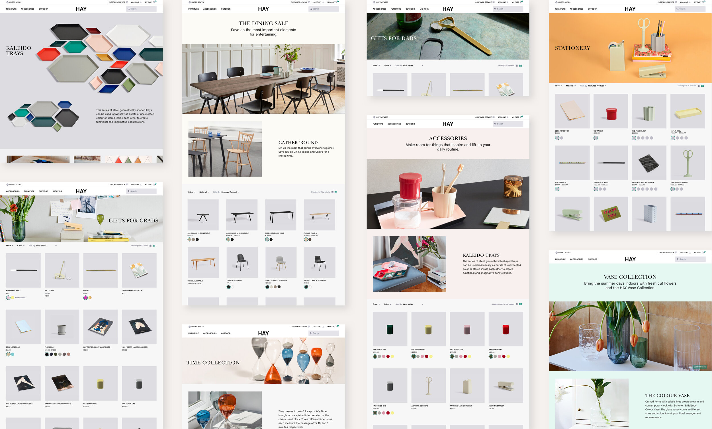
The three key areas of focus were navigation, homepage, and product detail page. Considerations that we kept in mind were price is important, images are highly influential, and scannable content was a must.
Improvements to current standards were made to enhance the customer experience. We added customer service
to the utility navigation with a curated set of popular customer service links to allows access to content quicker.
Depending on the page type, we implemented the ability to have search begin open or closed.
The intent is that search will be active on mobile homepage by default.
We provided art direction guidelines on various page components such as mastheads to ensure legibility and accessibility.


